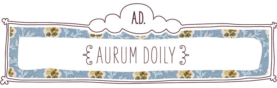
Which banner do you like best? Click the image to get a bigger view. If you have any cute vintage fabric textures to suggest don't hesitate! I love using fabric textures in a lot of my designs.

This is the old one. It's cute but I don't like it much anymore.

I was thinking about doing a banner design with a doily theme. For those of you who don't know what a doily is; it's basically like a lace coaster. People put them under cups, bowls, glasses, vases or just use them for decoration alone. I like them because they're cute and vintagey.
I start my new job Monday. I'm going out tonight to celebrate! I'll post next Friday to give an update on my first week of work. I'm so excited!
i like the one you have up right now best! the others are very girly, which is also cute. but i prefer the top one :))
ReplyDeleteI love the blue one! I'm biased though, since I much prefer anything blue to pink. But really, the blue one is so gorgeous!
ReplyDeletexx
I too like the blue the best it is still girly and shows your aesthetic but it is not too girly that it would put non girlies off!
ReplyDeleteAlso I like your typography very unique!
http://lisahollandesign.blogspot.com
I love them all. How talented you can make these up so easily!
ReplyDeleteWow, you designed these yourself! You're so talented. I love the blue one a lot (:
ReplyDeletei love ur banner! i wish i cld have one that creatively suited me!
ReplyDeletegood luck on ur new job :) i start mine monday too!
I like the pink banner best; hope that work is going well :)
ReplyDeletehttp://ladyonaroof.blogspot.com/
i like that your redesign includes the last headers pattern. so i think it's a successful redesign. from here you can always transition into a new pattern without changing the optics too much.
ReplyDeletepersonally i'm not too much into pink, so the one you chose is my favorite of the three options.